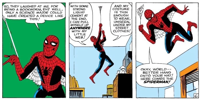
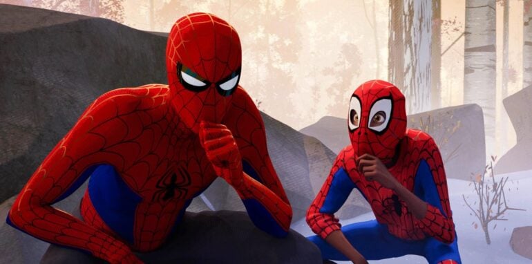
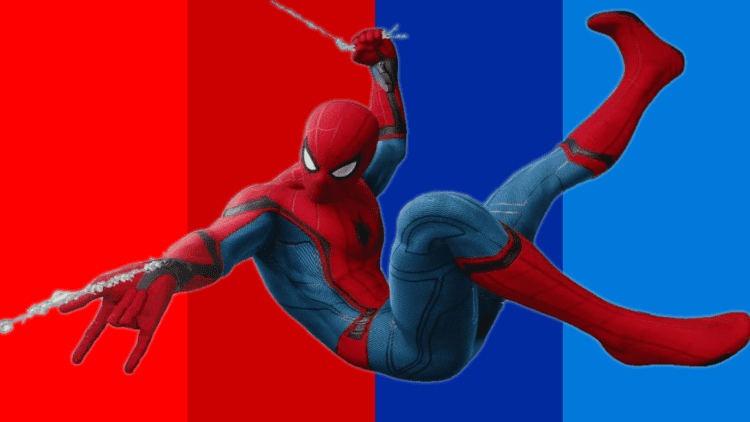
Spider-Man has been wearing one of the most recognisable suits ever since his first appearance in 1962. While most comic book characters undergo several redesigns to keep with the times, Spidey’s suit has remained more or less unchanged since his debut. Even when some artist decides to “retouch” the Spider-Man suit for an event or some other one-shot appearance, they often keep his red and blue colour scheme intact.
Despite the existence of some other heroes that wear red and blue (like Superman), these two colours have become synonymous with Spider-Man in popular culture. The question here is, why choose two colours that have absolutely nothing to do with spiders? The answer is quite simple: technology.
Printing Process

The early days of comics looked nothing like they do nowadays. Comic books had nowhere near the same cultural relevance that they enjoy now, not to mention the absurd amount of money made by either Marvel or DC in any given year.
Due to this, comics had to be printed using the cheapest methods available. Even if this meant that comics didn’t enjoy the same quality as other printed media, it also assured retailers that comic books would remain cheap to sell and even cheaper to produce.
As a result, character designers had to work around the limitations of their medium more often than not. For example, the first issue of The Hulk had the hero being completely grey, but due to the printing process, the colour didn’t look great on the book’s cheap pages. That’s why his colour was changed to green in subsequent issues – and the rest, as they say, is history.
In Spider-Man’s case, red and blue were chosen because they were brighter colours that registered well on paper and, more importantly, made the character easily recognisable against the grey concrete jungle that is New York.
This is also the reason why so many of Spidey’s early foes wear colourful costumes, too. Doc Ock’s green and yellow attire and the Green Goblin’s wonderfully gauche green and purple are the perfect examples of this early comic book trend.
As a more in-universe explanation, we have to keep in mind that Peter Parker’s original plans were to become a wrestler, not a crime fighter. This might also explain why the teenager chose two of the flashiest colours available to make his first costume.
Spider-Man’s Costume Wasn’t Supposed To Be Red & Blue

Steve Ditko, one of the original creators of Spider-Man and his first costume, didn’t envision the suit in its red and blue iconic colours at all. Ditko’s idea was to have a hero who wore orange and purple, something that would have made his look even more unique.
Since the early days of Spider-Man (remember Rabobi?), the superhero has had his fair share of attempted redesigns, even if none of them have stuck. The closest thing we’ve ever had to a modern take on the Spider-Man suit is the Iron Spider Armor, and that’s only sparingly in the comics.
Even when the 90s tried to turn every comic book character into an edgy version of themselves, Spider-Man’s red and blue colour scheme remained. Not even the messy “Ben Reilly Saga” could defeat the colours of one of the most legendary heroes in Marvel’s roster.
As is often the case in media, the ingenuity created by the limited resources made a colour scheme that was only designed to be cheap into an iconic look. We can only imagine how different Spidey would have been if he was orange and purple – probably a lot more popular around Halloween than he is now.
What is your favourite red and blue Spider-Man suit? Also, read our list of the strongest Spider-Man characters of all time.


SPIDER MAN