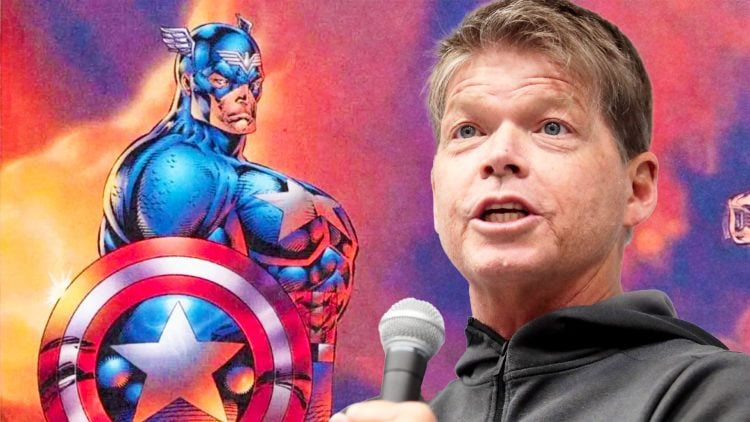
We’ve all seen it – that controversial image of Captain America by comic book artist Rob Liefeld, which seems to perpetually make the rounds on the internet. It’s been called everything from a marvel to a monstrosity, depending on who you ask. The 1996 image depicts Marvel’s stars and stripes superhero in a pose that has, over time, been harshly critiqued for its seemingly dubious grasp of anatomy. Some say it even led to a fatal heart attack for a beloved Marvel editor, but the truth is much more nuanced than the rumours suggest.
Part of the image’s infamy arises from its out-of-context proliferation. When it’s brought up, rarely is it presented with its backstory: what issue it’s from, why it exists, or even its intended purpose. Contrary to popular belief, this drawing was not featured in any issue of Rob Liefeld’s Captain America series. It was, in essence, promotional material.
Marvel’s Troubled Times and “Heroes Reborn”
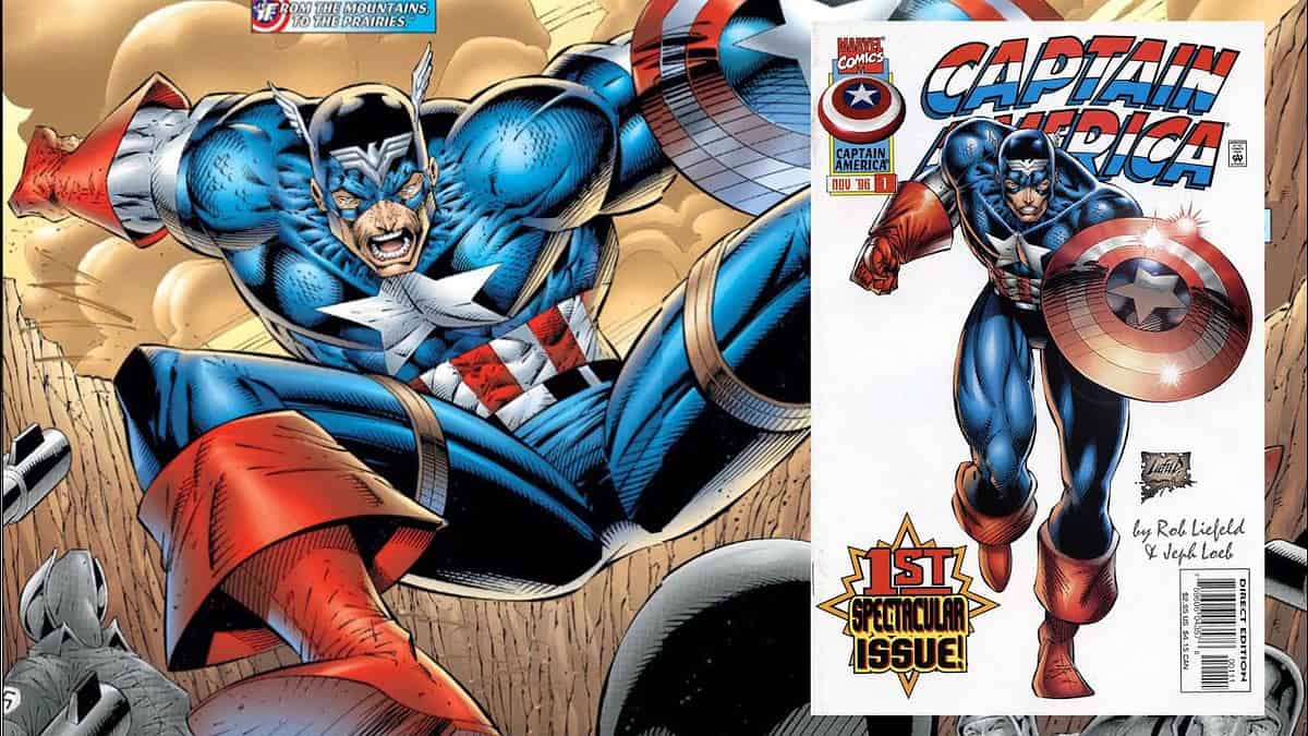
In 1996, facing both financial and creative struggles, Marvel took the decision to outsource some of their properties. Notable freelance artists, previously with Marvel, were handed the reins. Jim Lee took Fantastic Four and Iron Man, while Rob Liefeld’s Extreme Studios was given The Avengers and Captain America. This phase was termed “Heroes Reborn”. It was during this time that Rob Liefeld’s notorious Captain America artwork emerged. While it made appearances in various comic magazines, its significant detail remains: it was not intended for publication in the actual comic series.
Liefeld himself has reflected on the image, acknowledging its controversial nature and attributing some of its eccentricities to late-night decisions and ignoring feedback from peers.
Anatomy or Perspective
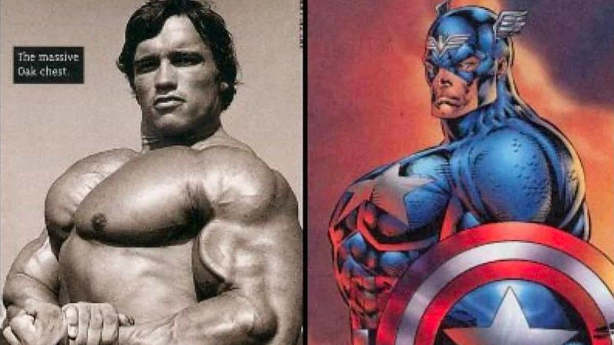
One of the primary criticisms Rob Liefeld faced was the ‘anatomically incorrect’ portrayal of Captain America. However, an in-depth analysis by webcomic artist Kelly Turnbull reveals a different perspective. Turnbull argues that the drawing might have been influenced by bodybuilding photographs of figures like Arnold Schwarzenegger, which are often shot from angles designed to exaggerate the chest. Moreover, the dimensions of bodybuilders can appear exaggerated even in reality, potentially misleading artists if they’re used as direct references.
When it comes to the specific critique of Captain America’s seemingly short arms in the drawing, it might be more of a problem of perspective than anatomy. Elements like the shield and its positioning play a significant role in creating the visual distortion.
Interestingly, another famed artist, Jim Lee, has produced artwork with a similarly exaggerated chest perspective, like his depiction of Batman in Batman Hush. The critical difference seems to be the overall balance and context in which the artwork is presented.
Liefeld, Gruenwald, and A Tragic Twist
One tragic rumour linked Rob Liefeld’s Captain America image to the untimely death of Mark Gruenwald, a revered Captain America writer and editor. This speculative and unfounded connection, it appears, is likely the product of contextual association rather than factual correlation. Both Liefeld and Gruenwald had a personal rapport, making the rumour not just baseless but also deeply insensitive.
The world of comics is rich and dynamic, with stories that span decades and intricacies that can sometimes get lost or misrepresented. While the infamous Rob Liefeld Captain America image will always spark debate, it’s crucial to approach it, like all art, with a balanced perspective and an understanding of its context.
RELATED: The 10 Most Muscular Superheroes
What are your thoughts on the Rob Liefeld Captain America artwork?
Sources: Panels to Pixels, marvel.com

